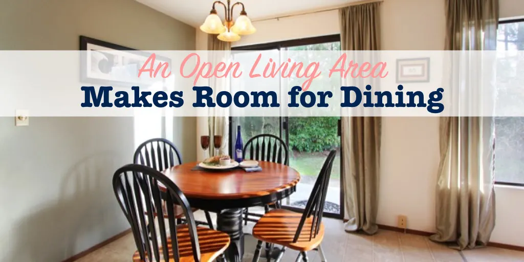
The open floor plan is one of the most popular home designs these days. Having the kitchen open to the living and dining areas means no one has to miss out on the party, or family activities, happening in the other rooms. And it just makes access to these spaces easier.
My home layout is just one big open living room, dining room and kitchen space. Well, I guess I can’t really call it big, but it is open. At least it is now.
Here’s my before and after pictures of how I created a dedicated dining room in my open concept living area.
Creating a Dining Room In Open Concept Layout
If you’ve seen my kitchen and living room updates, you know there used to be this awkward, and pretty useless little island in the middle of the space. It really interrupted the flow, and added very little function.
Removing this island made a huge step forward in transforming the space. Then I used a few more design tricks to create areas with a unified feel. Today’s feature is the dining area transformation.
Updating Traffic Flow
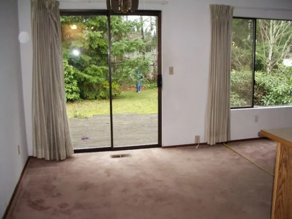
First off, the carpet in the eating area had to go. I replaced it with an easy-to-clean and budget friendly vinyl.
Side Note: I really like vinyl floors. Tile may be considered more “high end,” but I find it cold and practically impossible to clean the grout. Not only is vinyl less expensive, it’s warmer under foot, and much easier to clean.
Having the same flooring throughout helped to unify the eating area with the kitchen space. There is now an open flow between the two.
New Lighting
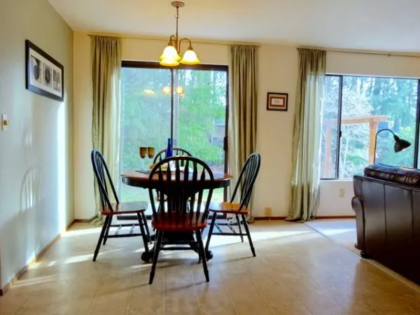
The dining table is centered under a new light fixture.
I wish I had a good picture of the old one, because it was truly ’80s decor. Polished brass with smoke glass panels. Oh, it was hideous. You can just see part of it in the Before photo.
Changing out a light fixture is an instant and relatively inexpensive update that can have a huge impact.
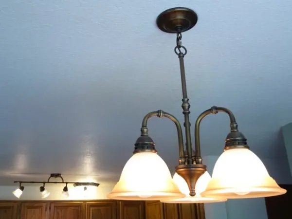
I chose a simple hanging fixture that coordinates with those I used in the kitchen. Mine are from Lowe’s.
Paying attention to coordinating items within an open space is what helps you create an intentional and put-together look.
Decor
To create a cohesive look with the adjacent living room, I used the same sage green curtains and accent color (Olympic’s Smoky Slate from Lowe’s). I painted one small wall a soothing sage green.
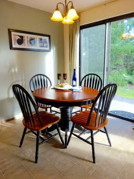
I also created some simple custom photo artwork for the wall.
I’m a huge fan of personalized artwork. Throughout most of my home, I have decorated with photos that have special meaning to me.
Furniture
Of course, every eating area needs a table and chairs.
The table I had when I first moved in was rectangular, and just a little bit awkward in the space. In this open area, I really felt that a round table would work best.
I searched, and searched for an affordable round table with a central leaf. I wanted something that could open up to accommodate more people when needed.
(Round tables with drop leaf ends are easy to find. But finding one that can expand with a center leaf is trickier. Try searching for “butterfly leaf” tables.)
Finally, I found a table that is absolutely perfect for the space.
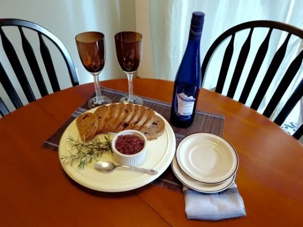
The natural wood top coordinates with my oak kitchen cabinets, and earth tones in the living room. The black painted portions also tie in with the black in the kitchen countertop, and other black accents in the living room.
The colors create a visually cohesive look. The round shape of the table also helps with traffic flow through the kitchen area, and out the sliding glass door.
In the warm months, my open living area opens up even more to include the outdoor living space.
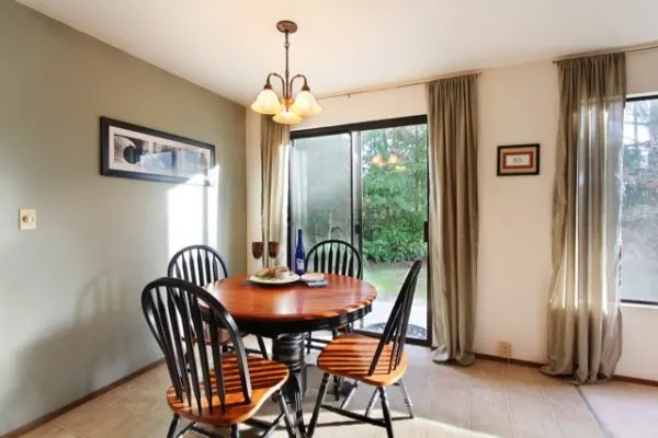
And that is how this one small corner of the home became its own important part of the flow of daily life.

